Unveiling the Psychology of Color: How Your Paint Choices Affect Mood and Perception Feb 21, 2026
Color psychology is a fascinating field that explores how colors affect our emotions, behavior, and perception. Each hue we incorporate into our environment can evoke distinct feelings and associations. As you consider your next painting project, let's explore how different colors can impact mood and perception, so you can make informed decisions that align with your vision.
Warm colors, such as red, orange, and yellow, are known for their invigorating qualities. Red, for instance, is a color associated with passion and energy. It can stimulate conversation and excitement, making it a perfect choice for dining rooms or social spaces. However, in excess, red can be overwhelming, so it's best used as an accent color.
Orange is another vibrant hue that radiates warmth and enthusiasm. This color can foster creativity and inspire action, making it an ideal option for a home office or fitness space. Yellow, the color of sunshine, is cheerful and uplifting. It can brighten any room but should be used sparingly to prevent overstimulation.
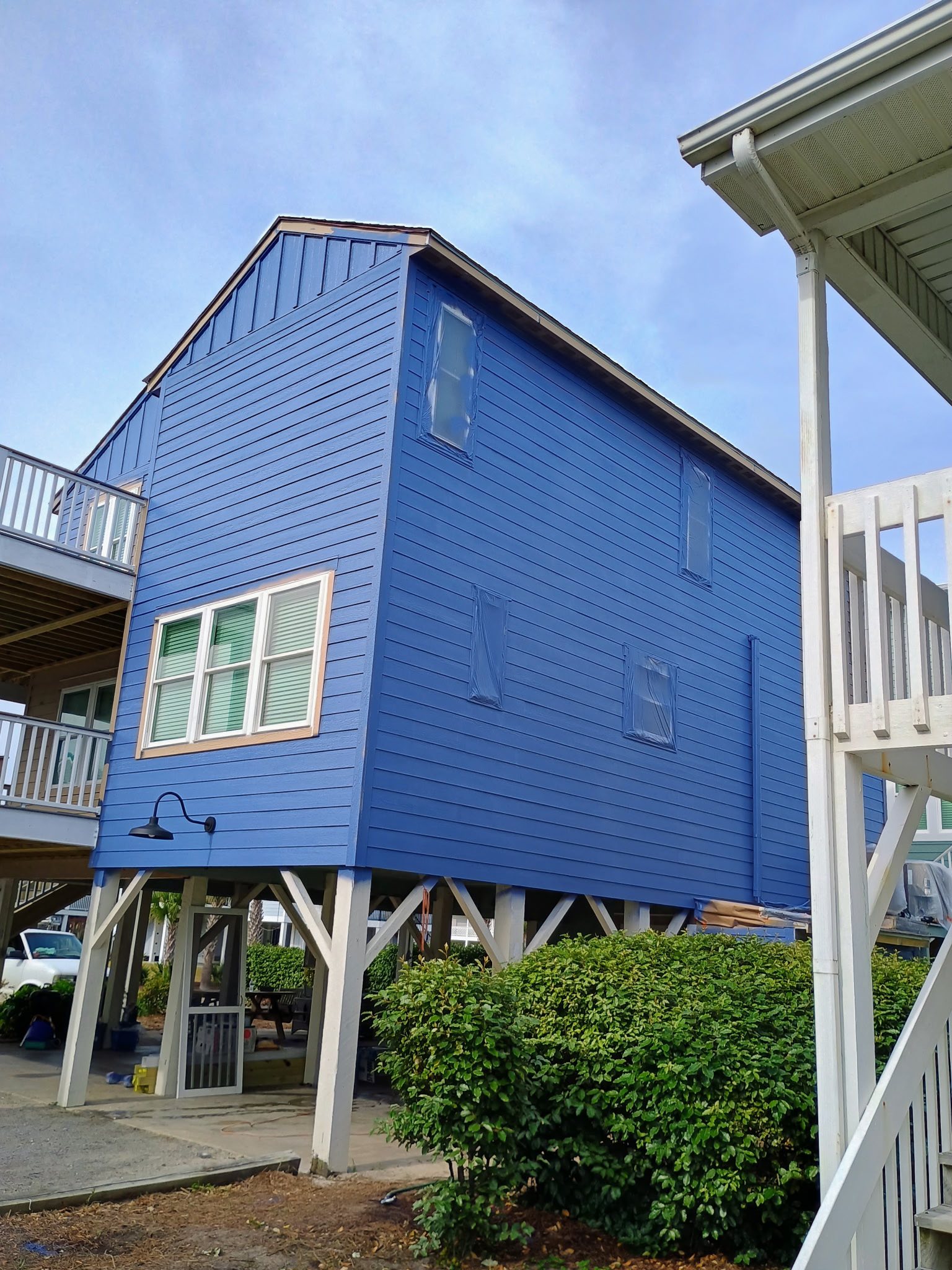
On the other end of the spectrum, cool colors like blue, green, and purple have a calming and soothing effect. Blue is widely recognized for its serene and tranquil properties. It is often used in bedrooms and bathrooms where relaxation is key. When selecting a shade of blue, consider the light in your space, as darker blues can become somber in dim settings.
Green, the color of nature, brings a sense of balance and renewal. It is a versatile color that works well in almost any room, complementing a variety of styles and furnishings. Whether you choose a muted sage or a vibrant emerald, green can evoke feelings of harmony and growth.
Purple is associated with luxury and creativity. Lighter shades, like lavender, can induce calm and relaxation, making them suitable for bedrooms and meditation spaces. Deeper purples, such as plum, add a touch of sophistication and can be used to create an intimate, cozy atmosphere.
Neutral colors, including white, gray, and beige, serve as a versatile canvas. White exudes purity and simplicity and is perfect for creating a minimalist aesthetic. Gray, a popular modern choice, can range from cool to warm tones, offering depth and sophistication when paired with bolder colors. Beige is inviting and comforting, providing a grounded and neutral background.
The context and purpose of a room should guide your paint choices. Consider who will use the space and how often. A color that works in a bustling family kitchen might not be suitable for a tranquil reading nook. Remember, lighting plays a critical role in how colors are perceived, so test paint swatches under different lighting conditions before making a final decision.
In conclusion, the colors you choose for your home can profoundly affect your mood and perception. By understanding the psychological effects of different colors, you can create spaces that not only look beautiful but also feel harmonious and personalized. Whether you’re looking to energize or relax, PJ's Interior-Exterior Painting is here to help you translate your vision into a transformative reality. Let us guide you through the vibrant world of colors to achieve the mood and atmosphere you desire.
/filters:no_upscale()/filters:format(webp)/media/27f92a9d-8296-482c-9eab-799eccd577d2.jpeg)